Get Inspired by 10 Successful Giving Tuesday Campaigns

Request a Demo
Learn how top nonprofits use Classy to power their fundraising.
As we roll into the last few months of the year, nonprofit organizations are gearing up to plan successful Giving Tuesday campaigns that help them capitalize on the global giving day. Giving Tuesday, which we consider to be the kickoff to the holiday season at Classy, is a massive opportunity for nonprofits to raise money after the consumer-driven holidays of Black Friday and Cyber Monday.
We sat down with the customer success management team at Classy for their advice on how to design a successful Giving Tuesday donation page. For more helpful information like the lessons below, be sure to check out our free Giving Tuesday resource library.
1. Appeal Section
To maximize conversions and keep your potential new donors interested, expand upon the appeal you included on your Campaign Landing page and be mindful not to reiterate the exact language you’ve used in previous campaign sections.
Never miss an opportunity to recruit new recurring donors. By turning on our Recurring Donations Optimization Initiative when setting up your donation page, you can give your Giving Tuesday donors the opportunity to make their gift a monthly donation.
2. Frequently Asked Questions (FAQs)
FAQs will only appear on desktop view. If you receive common questions throughout the day, consider adding FAQs to inform your donors about tax deductibility, how funds are utilized, and more.
3. Buttons
To ensure you’re not leaving any money on the table, the lowest suggested gift amount should reflect your typical average donation size (either for online giving holistically or from past Giving Tuesday campaigns).
4. Custom Questions
When adding custom questions, be mindful of whether the data collected from your supporters will make an impact on your fundraiser. To maximize conversation rates, consider removing unnecessary custom questions altogether or ensure the question is not required to submit the donation form.
5. Donor Covered Fees
Donor Covered Fees should always be turned on in the back-end of Classy. When it is, and checked by default, 80% to 85% of donors opt to cover the fees. On a day like Giving Tuesday, that can add up to real savings for your organization.
6. Donate Button
In your Advanced Designer, you can customize the text on your Donate button. If you choose to do so, keep it short, sweet, and action-oriented.
Visit This Year’s Giving Tuesday Resource Center
Below are the top 10 campaigns that we featured on Classy’s 2020 Giving Tuesday Resource Center and what we loved about them. Apply these takeaways to your own initiative, so you can create a successful Giving Tuesday campaign that knocks it out of the park.
Get Inspired by 10 Successful Giving Tuesday Campaign Examples
1. The Younique Foundation
One of the most important elements of a successful Giving Tuesday campaign is strong storytelling that draws in visitors. The Younique Foundation is an organization that inspires and provides resources for women who were sexually abused as children and educates and empowers caregivers to protect children from sexual abuse. They creatively leveraged imagery, copy, and video on their Classy fundraising campaign page to share the personal story of an individual impacted by their work, and how Giving Tuesday donations will continue to make a difference.
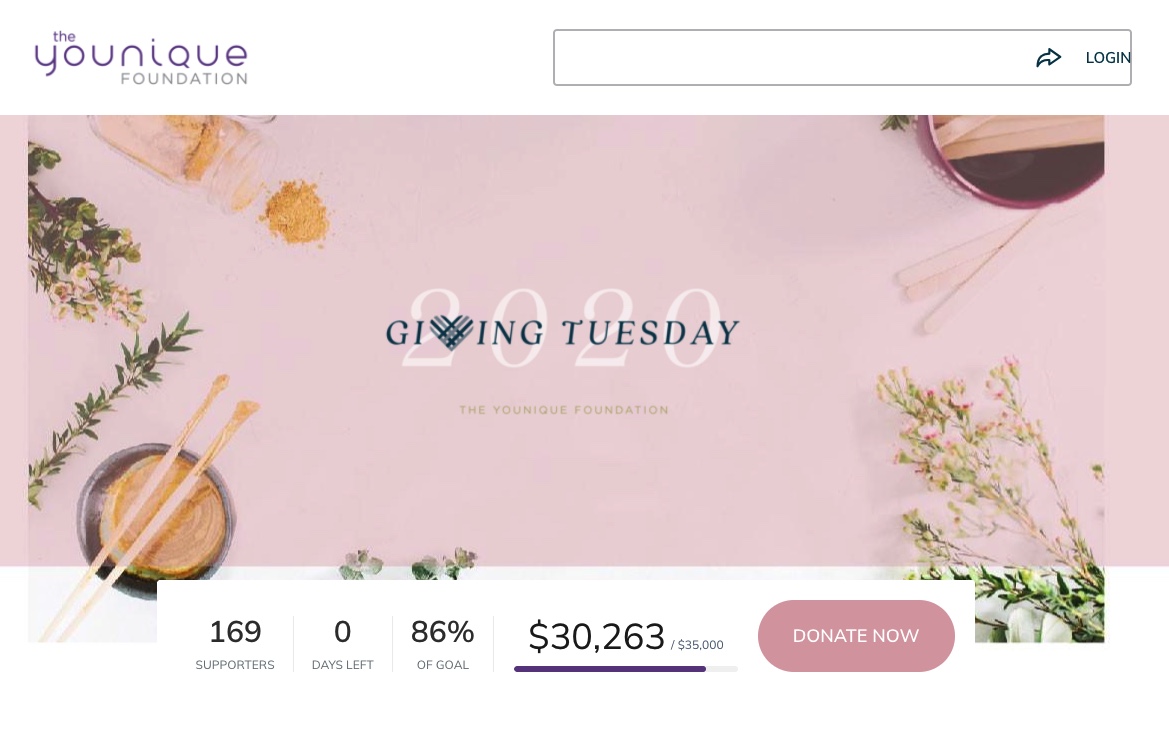
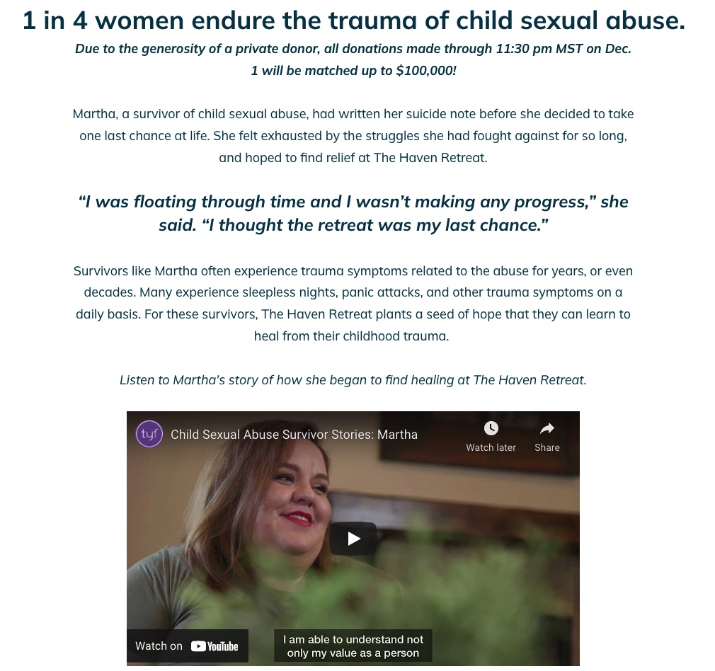
The clear, well-written copy immediately draws in the reader and makes an emotional impact, complete with a firsthand quote from a beneficiary. We love how that leads you into a video to hear directly from that individual and dive further into her story.
As the visitor continues on the campaign page, the copy and imagery clearly communicate how each donation will make a difference for these 170 survivors. Impact blocks articulate exactly how different gift amounts will provide value throughout these individuals’ healing journeys.
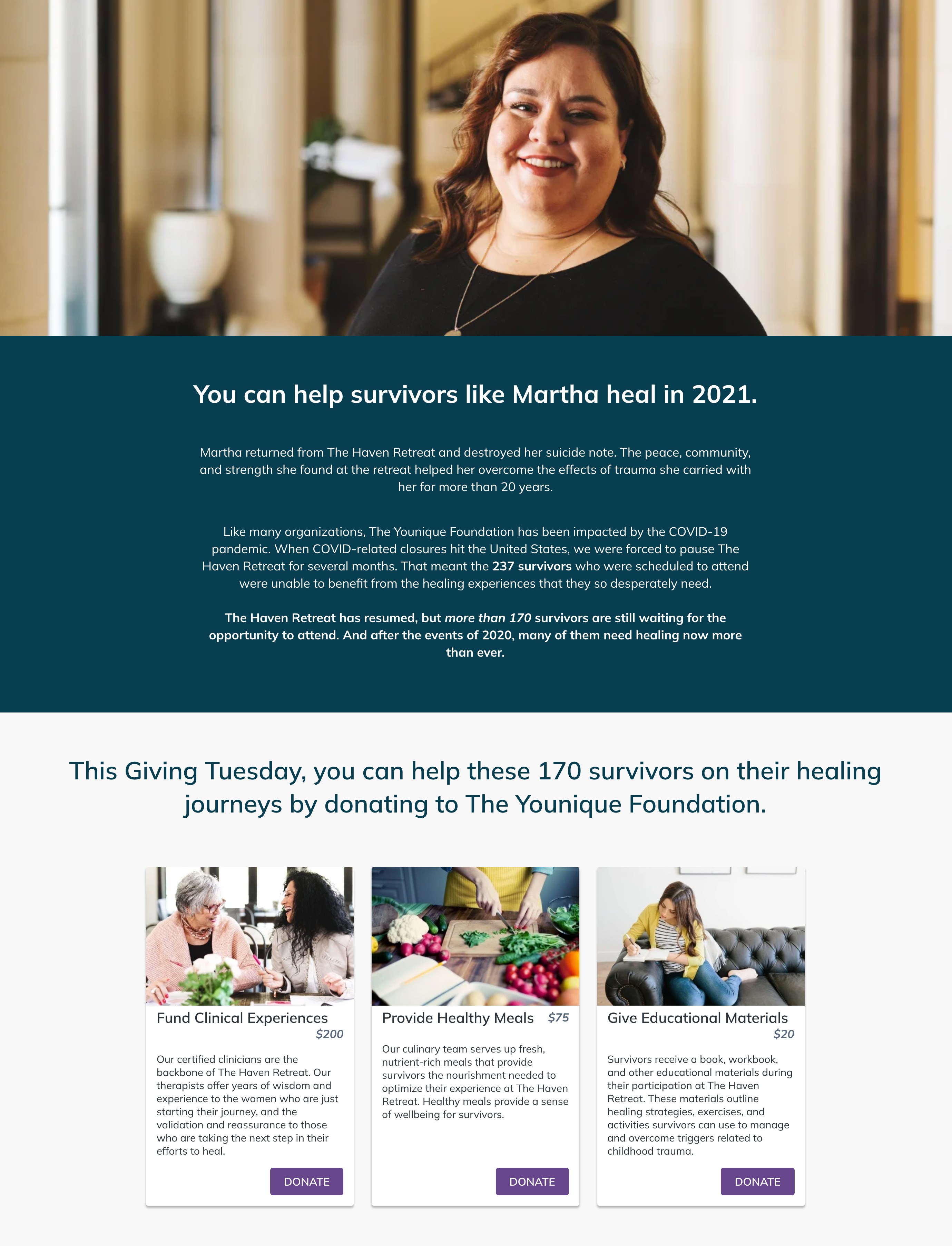
Takeaway for Your Giving Tuesday Campaign: Highlight specific beneficiaries’ stories so that visitors can identify personally with someone impacted by your organization’s work. Use clear language and strong imagery to communicate how supporters can play a role in these individuals’ next chapters.
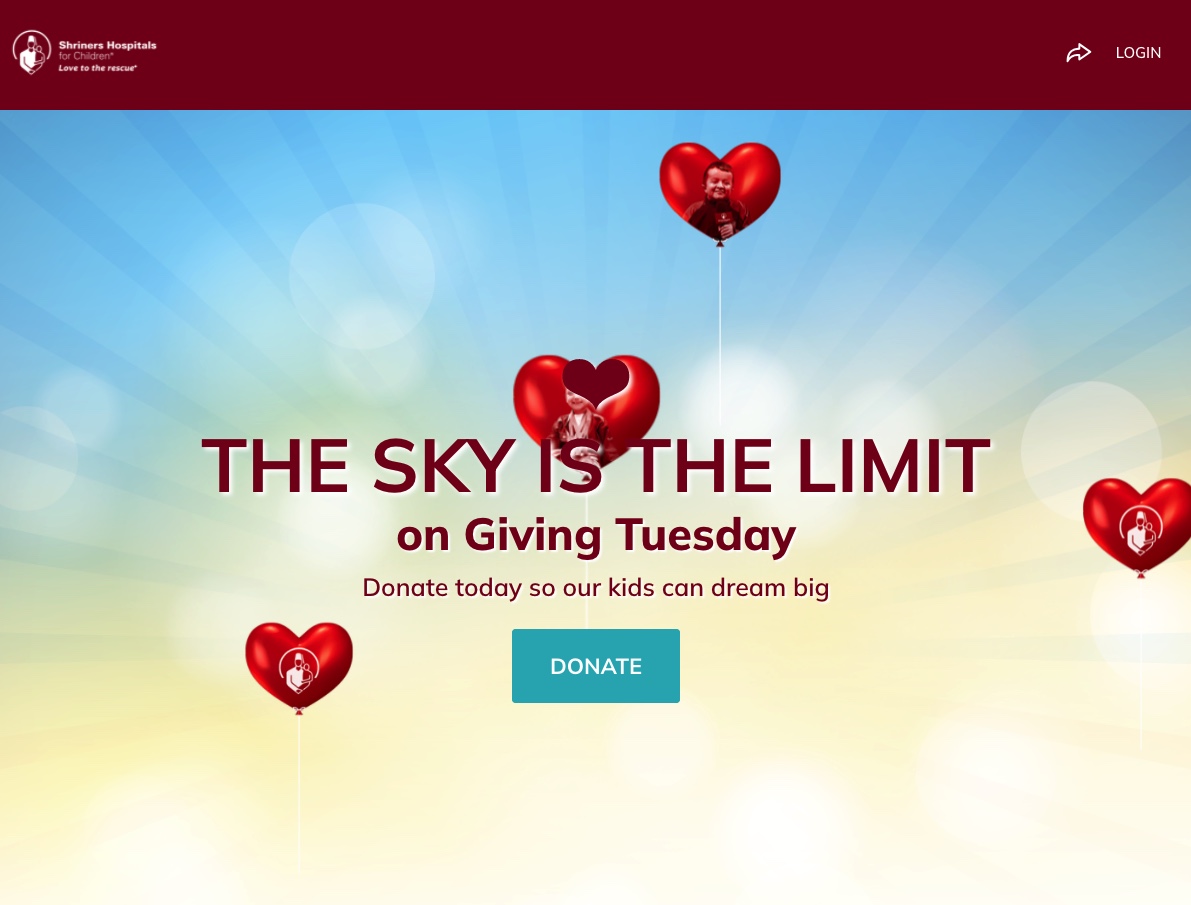
2. Shriners Hospitals for Children
Creativity is a common trait among successful Giving Tuesday campaigns. Those who creatively hook in their visitors immediately can increase their chances of drawing them through checkout.
Shriners Hospitals for Children leaned on exciting graphics to create a unique, engaging hero block at the top of their Giving Tuesday campaign page. They used balloons with the faces of children impacted by the organization that float up through the block behind the campaign title. That visual is paired with the copy, “The Sky Is the Limit on Giving Tuesday,” encouraging donations that will help children dream big and reach for the stars.
The Giving Tuesday campaign page continued to explain that when Shriners Hospitals for Children reaches their goal, they will host a virtual balloon release on Facebook as a thank you. One virtual balloon was released for every donor who contributed to the campaign. We love that this includes a call to action to follow Shriners Hospitals for Children on social media to catch the action.
The impact blocks also each creatively feature a child whom donors can support along each of their dreams. These are the same faces on the floating balloons in the hero block.
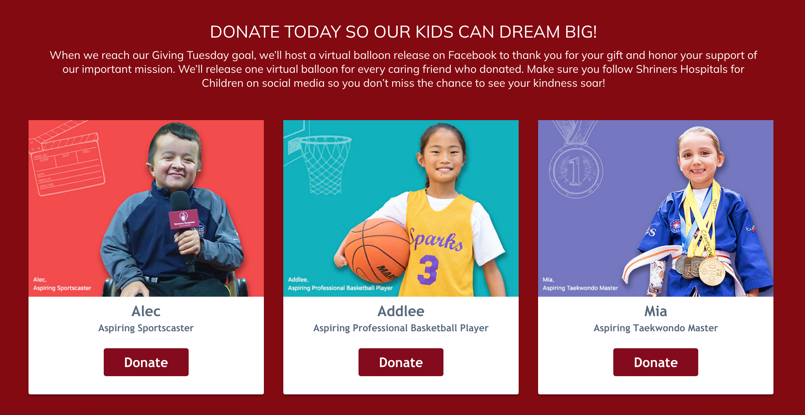
Takeaway for Your Giving Tuesday Campaign: Consider how you can infuse creativity into your Giving Tuesday campaign—from exciting visuals to your powerful, direct messaging—and connect it with your overall campaign theme so there’s no question about how your supporters will advance your mission.
3. Kent State University
The visual and interactive experience of your Giving Tuesday campaign can be a big factor that both spotlights your organization’s branding and engages prospective donors to take action.
Take Kent State University, for instance. Their successful Giving Tuesday campaign embodies their branding from top to bottom. Their hero block pops with custom graphics, and customized buttons throughout the campaign page to visually engage visitors. Including buttons also creates an interactive experience for those who want to learn more about specific initiatives.
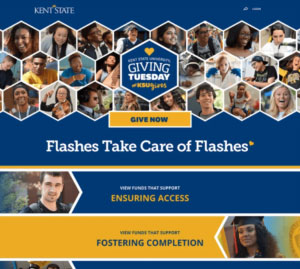
Takeaway for Your Giving Tuesday Campaign: The fundraising platform you choose to create your Giving Tuesday campaign matters. Kent State was able to create this fully customized campaign experience on Classy, bringing their branding to the forefront through every element of their campaign page.
Learn how Classy can help you create a successful Giving Tuesday campaign and offer a stellar giving experience for your supporters.
See Classy In Action4. Prisma Health Midlands Foundation
Strong hero images continue to be a recurring theme as we hit our next successful Giving Tuesday campaign from Prisma Health Midlands Foundation. This organization engages community partners to enhance health care for patients and families served by Prisma Health-Midlands.
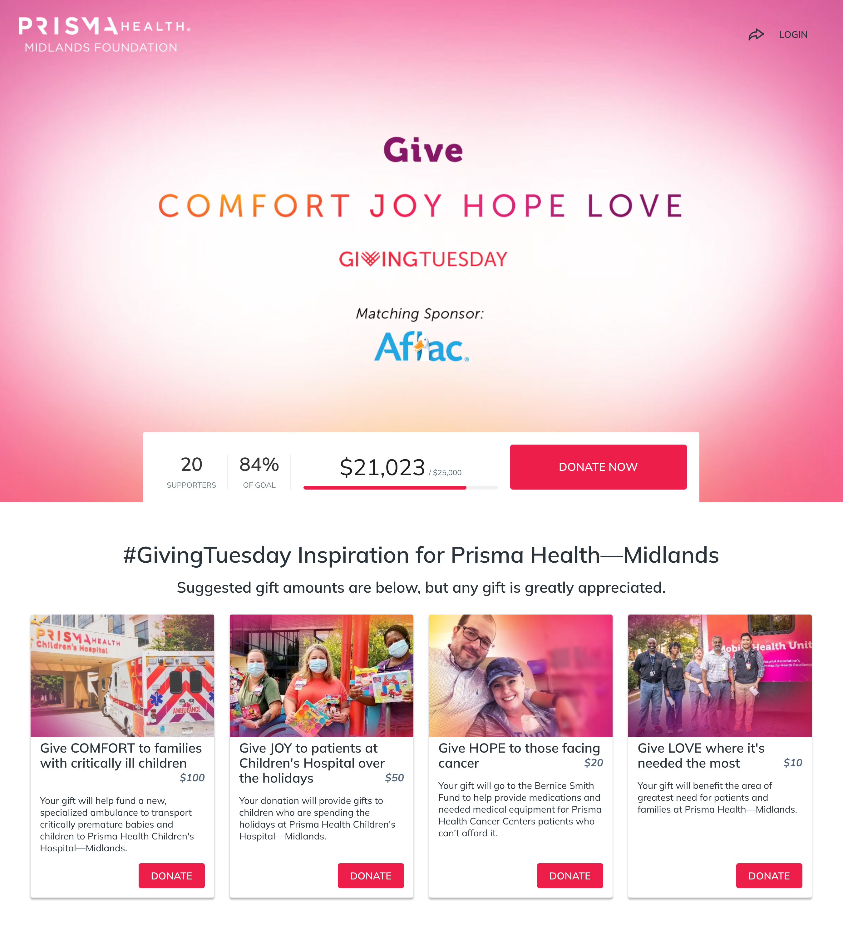
The colorful hero image grabs visitors’ attention right away. We also see the pink gradient carried throughout the entire campaign as a strong branding element that spans each image they use for their impact blocks. The impact blocks feature quality images and a good text length that keep things clear and succinct.
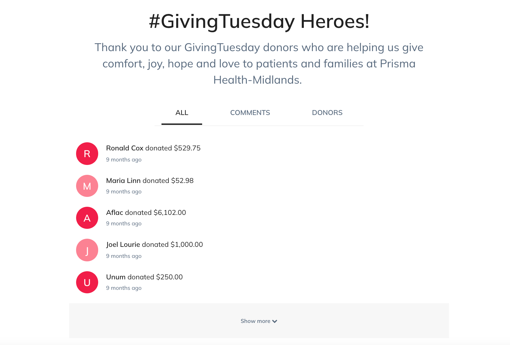
The organization also titled their activity wall—a feature on the Classy platform that serves as a hub of communication between the organization and their donors or fundraisers—to recognize supporters as Giving Tuesday heroes, which is a nice touch to show donor appreciation.
Takeaway for Your Giving Tuesday Campaign: Get creative with how you tie your campaign visuals together to create a cohesive look and feel throughout the page. A gradient is one such option. Also consider how you can help your donors identify as generous participants in the solution of the social or environmental problem you address.
5. Epilepsy Florida
Epilepsy Florida is a nonprofit organization that serves those impacted by epilepsy and the challenges caused by seizures. They created a successful Giving Tuesday campaign that harnessed engaging media, helpful resources for supporters, and an overall stellar campaign flow.
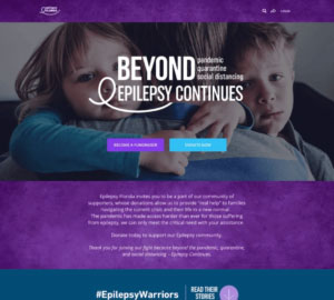
The organization used high-quality, engaging imagery from their hero block, all the way across their page. Visitors learn about the organization through GIFs, videos, and creative impact blocks. Their copy encourages prospective supporters to step up as partners in their mission, including language that “invite[s] you to be part of our community of supporters.”
The Giving Tuesday campaign page flows and builds on itself, bringing visitors to a graphic that links out to stories and testimonials of individual beneficiaries. The organization also offers a social media toolkit that includes sample social posts and a resource PDF.
Takeaway for Your Giving Tuesday Campaign: Consider including or linking out to content like testimonials and social media resources to connect donors with your work and equip them to evangelize your cause.
6. Vanderbilt Health
Successful Giving Tuesday campaigns often weave in specific branding for the giving day throughout the page. Vanderbilt Health makes that visual splash with their beautifully designed hero image, which marries the classic Giving Tuesday branding with their own campaign’s look, feel, and theme.
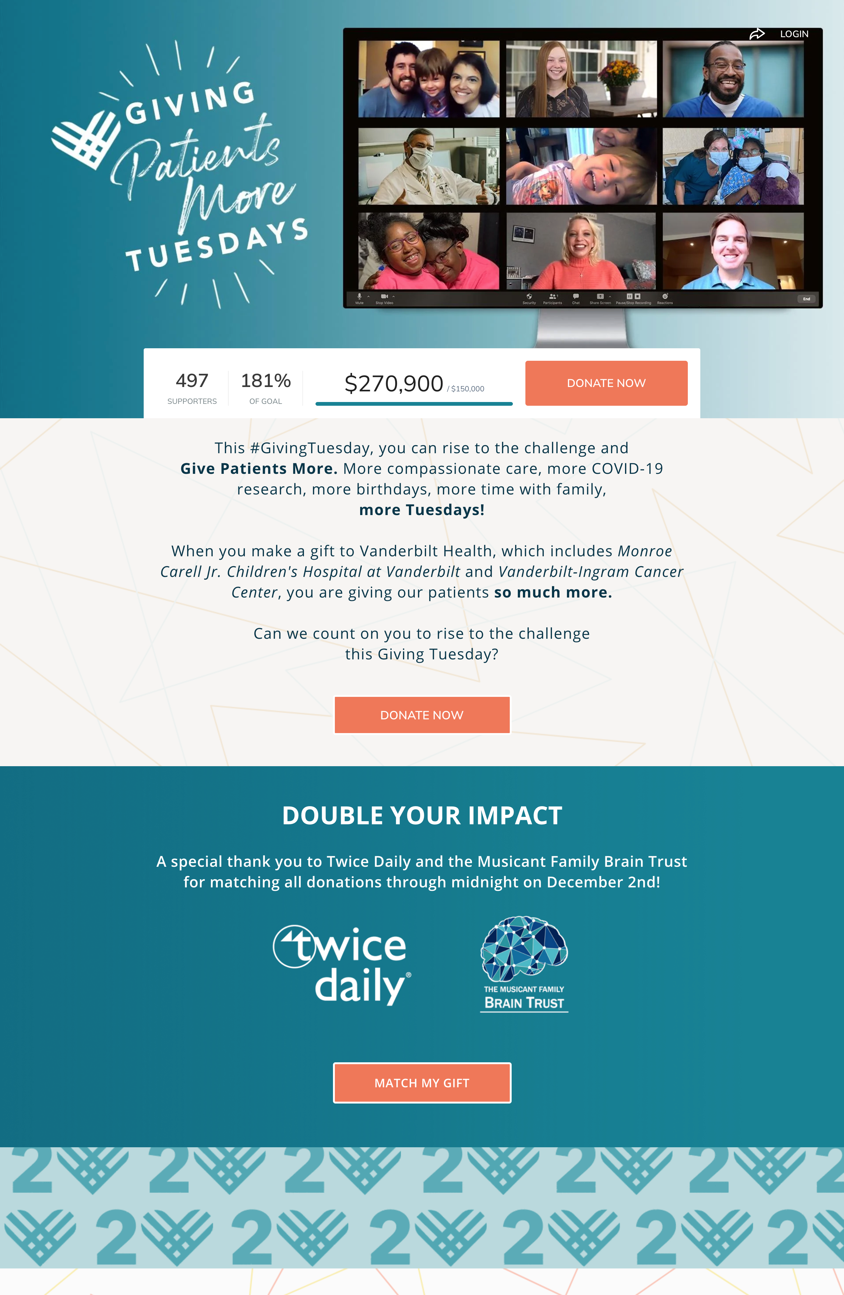
The rest of the campaign page carries consistent brand elements, along with clear text defining the campaign’s goal and inviting supporters to take part. We also love how they used a custom block to highlight the donation match, and custom CTA copy emphasizing that donors can stretch their dollars.
Explore the Top Matching Gift Q&A
Clear impact blocks and a video featuring an individual’s personal story continue to show supporters how their gifts will make a difference.
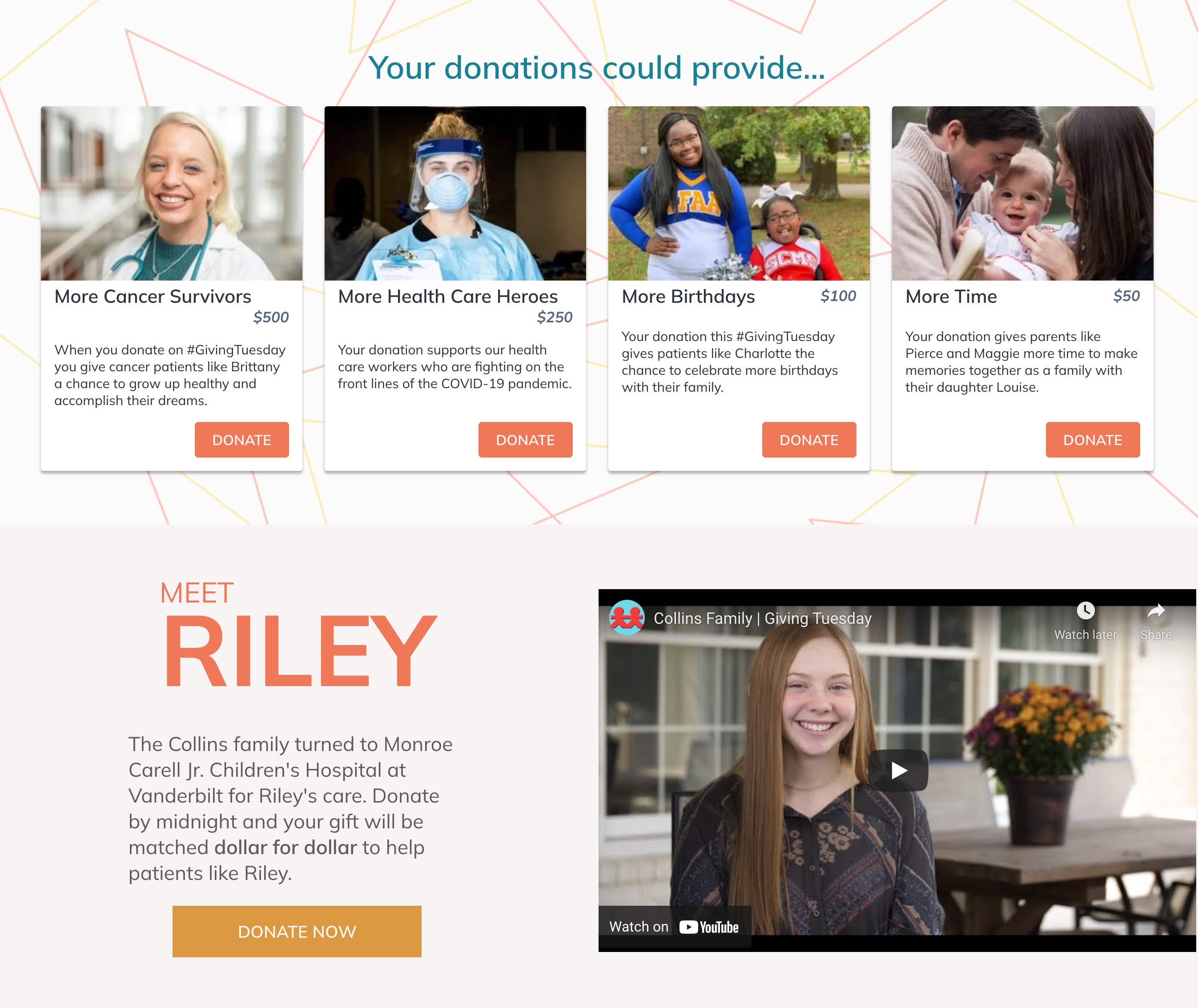
Takeaway for Your Giving Tuesday Campaign: Beautiful imagery and tasteful, consistent branding will only enhance your campaign’s overall appeal as visitors make their way through your Giving Tuesday campaign page.
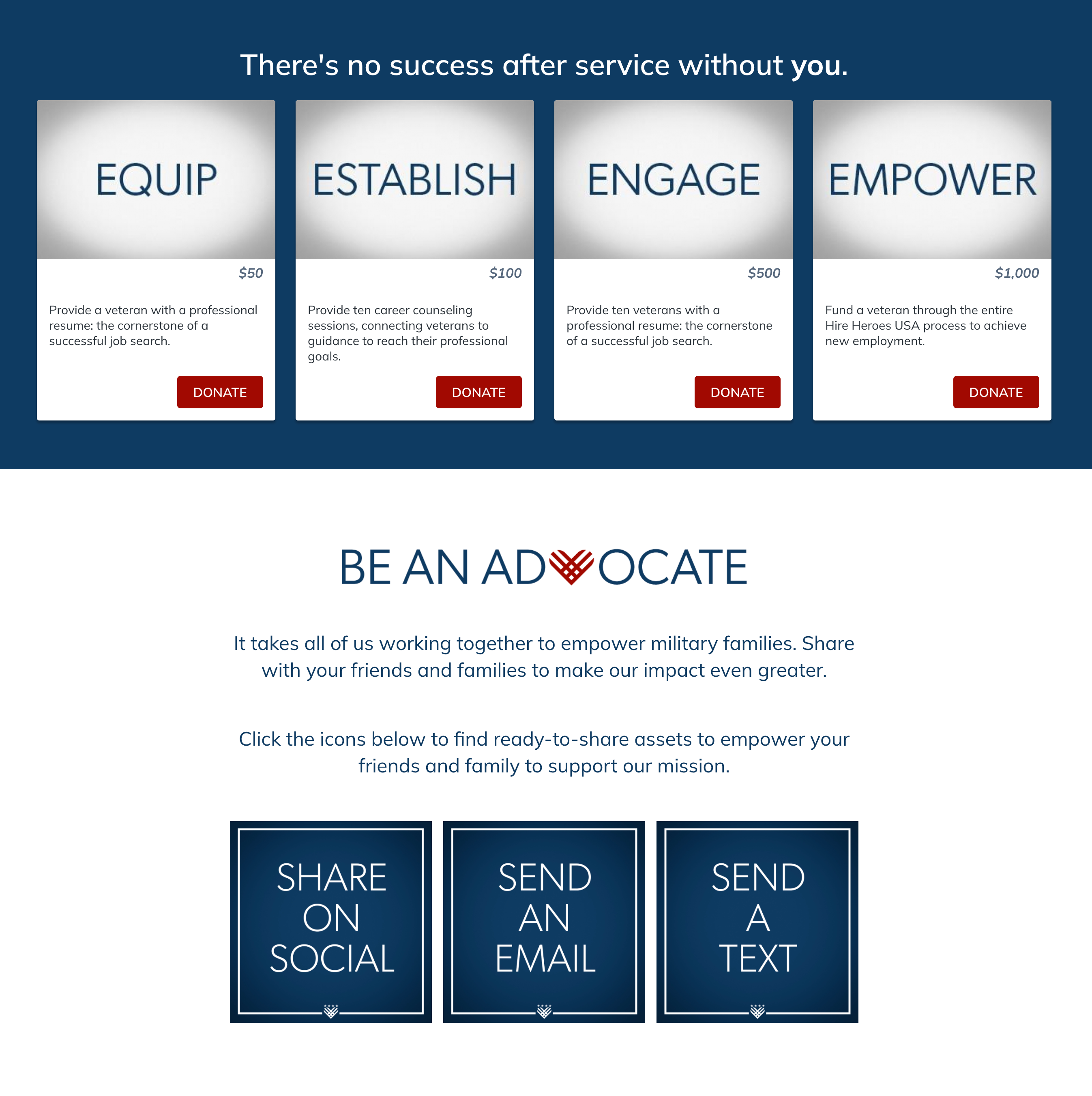
7. Hire Heroes USA
Hire Heroes USA created a successful Giving Tuesday campaign that had a clear, powerful theme to empower veterans and military spouses. They also wove in Giving Tuesday branding with their own campaign branding elements, from the custom hero image to other headings on the page.
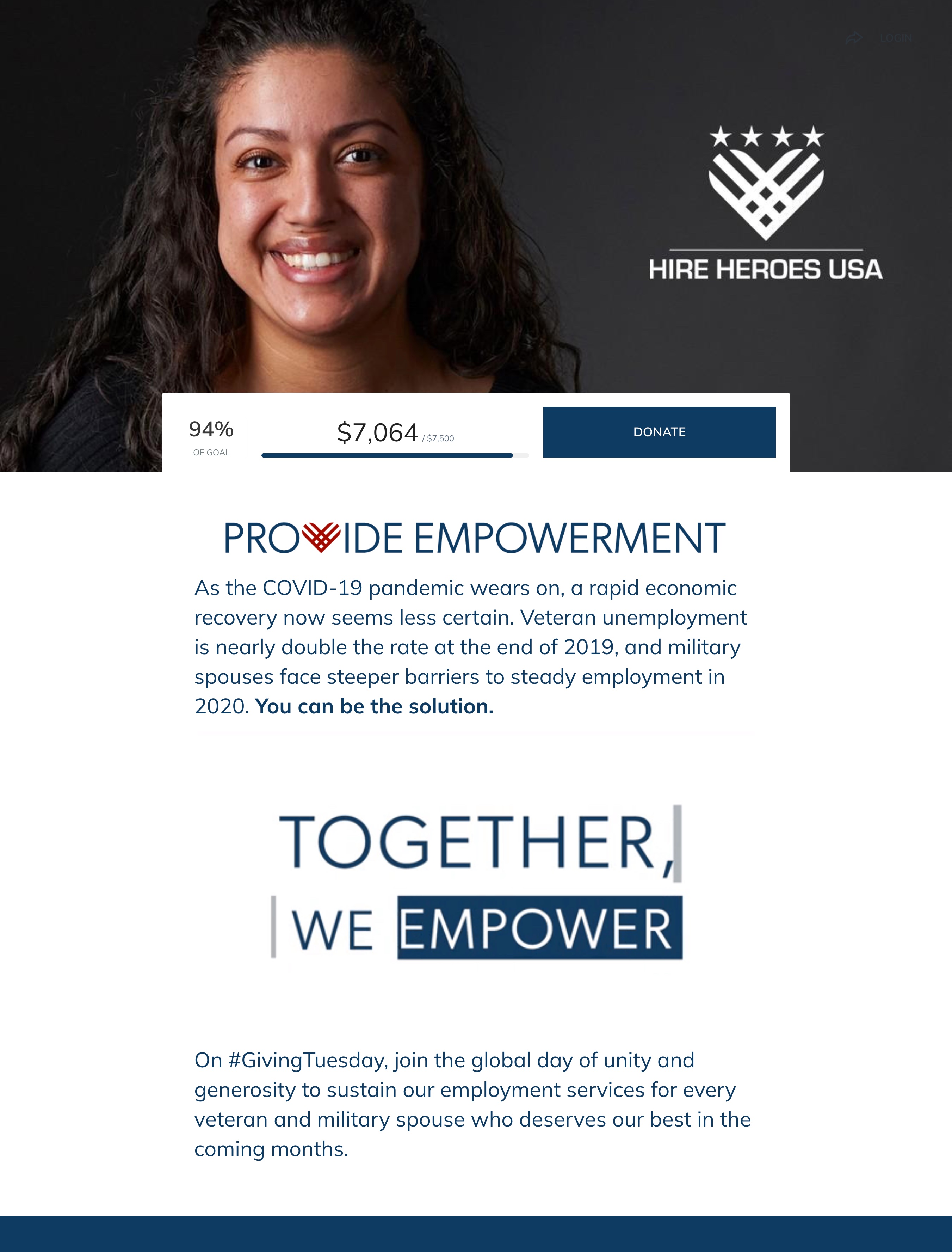
Typography was a huge branding element for this campaign. A GIF spells out “Together, We Empower” serves as a visual moment that captures visitors’ attention. The engagement continues with text that plays a huge part in their campaign aesthetic as you scroll to their impact blocks, which feature specific words in the box where images typically are used.
8. Room to Read
Many organizations opt to create crowdfunding campaigns or custom donation pages for their Giving Tuesday campaigns, but you might consider peer-to-peer fundraising to activate your community. Get them more deeply involved and eager to spread the word about your cause like this example from Room to Read. Room to Read is a nonprofit organization dedicated to children’s literacy and girls’ education across Asia and Africa, created a stunning, successful Giving Tuesday peer-to-peer campaign to kick off their holiday season.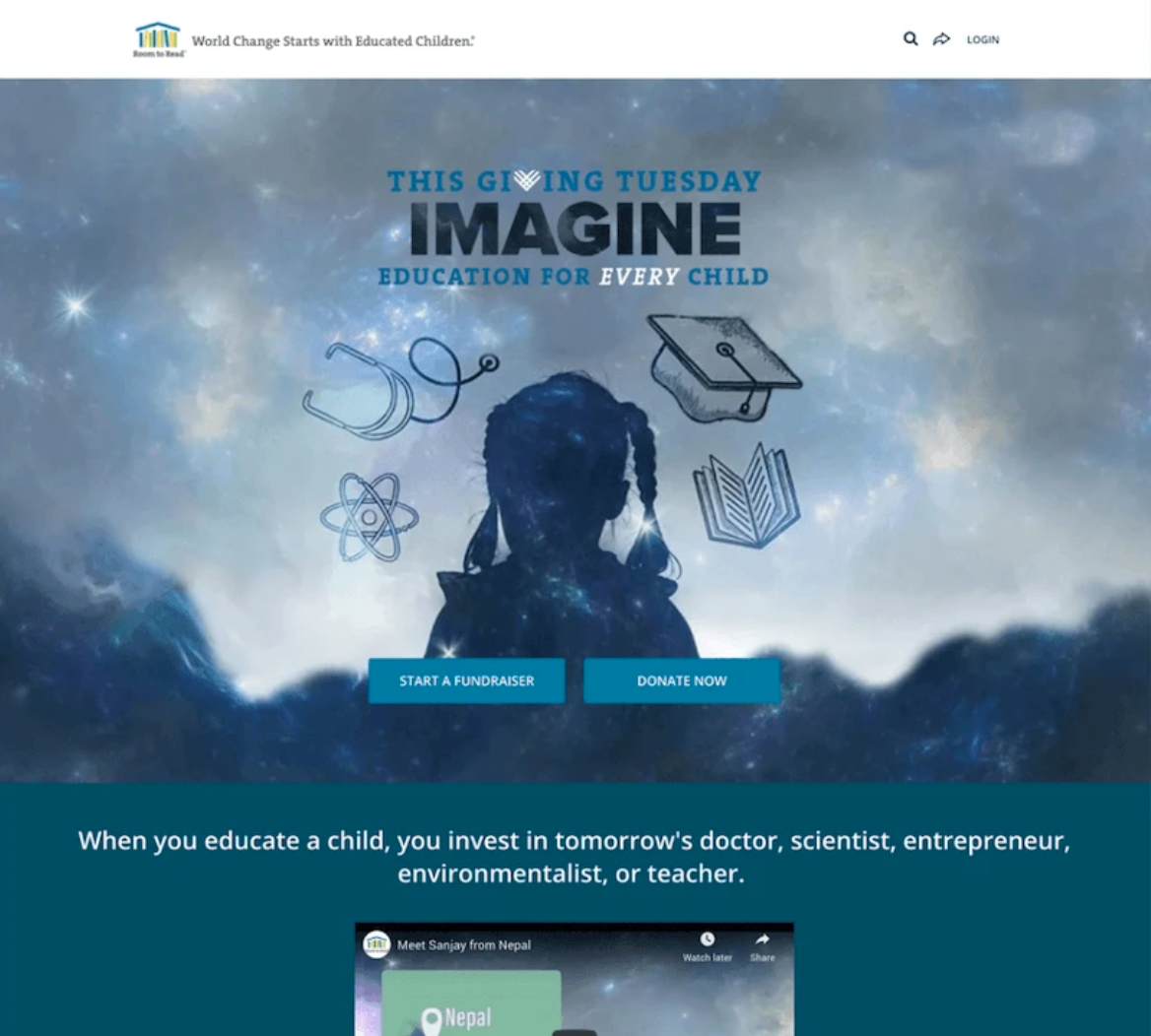
A captivating hero image instantly draws visitors in at the top of the page, followed by video highlighting the organization’s work. Custom impact blocks with beautiful images are striking and inviting. They showcase how fundraisers can move the needle for girls’ education and literacy.
Takeaway for Your Giving Tuesday Campaign: Much of your ability to use beautiful imagery and create a stunning campaign will depend on the customization and capabilities of the fundraising software you choose. With a platform like Classy, you can create a mobile-responsive, stunning Giving Tuesday campaign that puts your story and brand first, regardless of your personal design experience.
9. Pikes Peak – America’s Mountain
The stunning imagery and branding across Pikes Peak’s successful Giving Tuesday campaign contribute to a powerful donor experience. Custom blocks detail how supporters’ donations can name a piece of Pikes Peak and not only preserve the mountain, but also celebrate loved ones or memories.
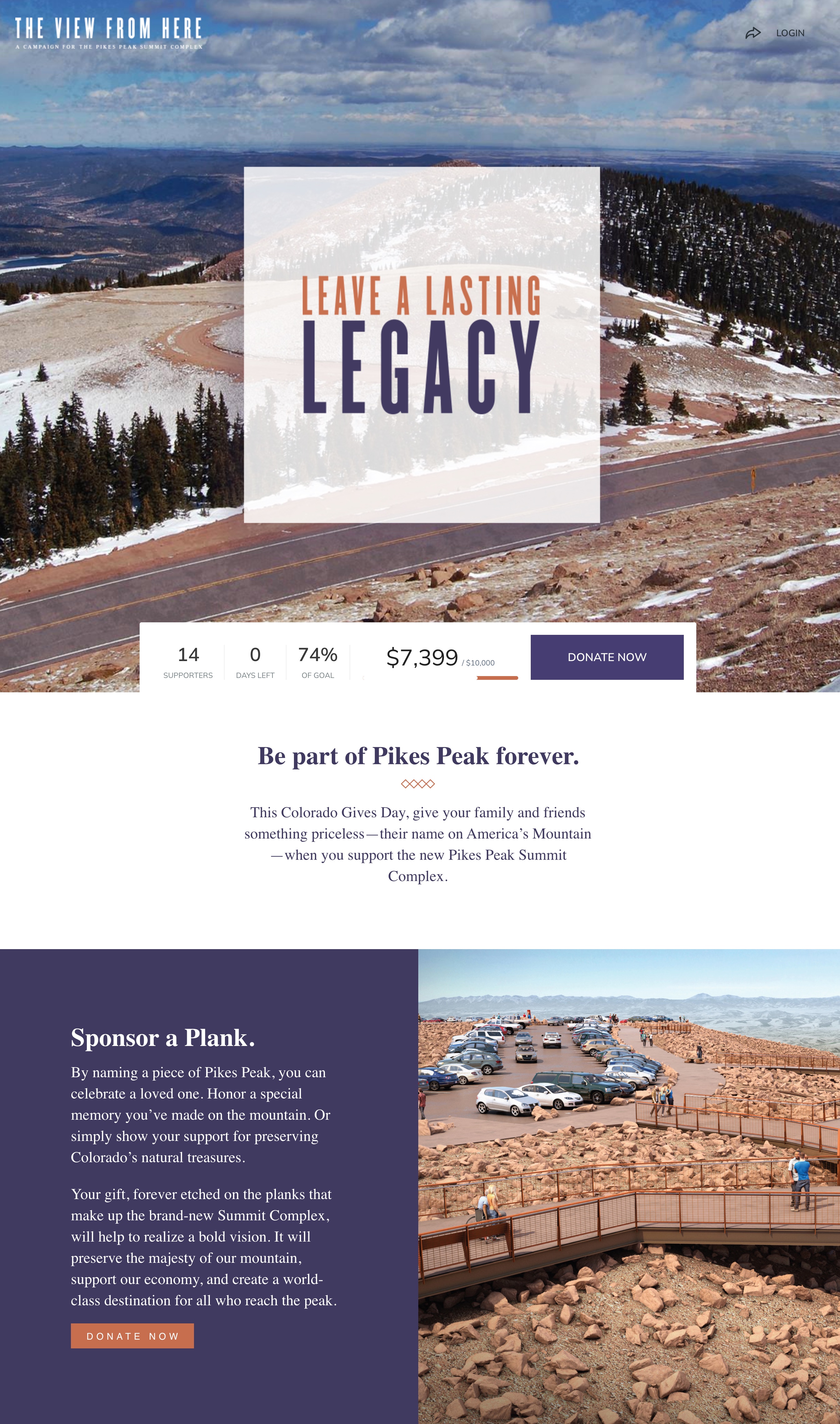
The rest of the campaign design seems to channel the likes of curated magazines and websites to capture the majestic mountain and initiative that supporters would help preserve. Thorough, detailed copy breaks down how the new Summit Complex contributes to a vibrant community, and how donations will make it a reality.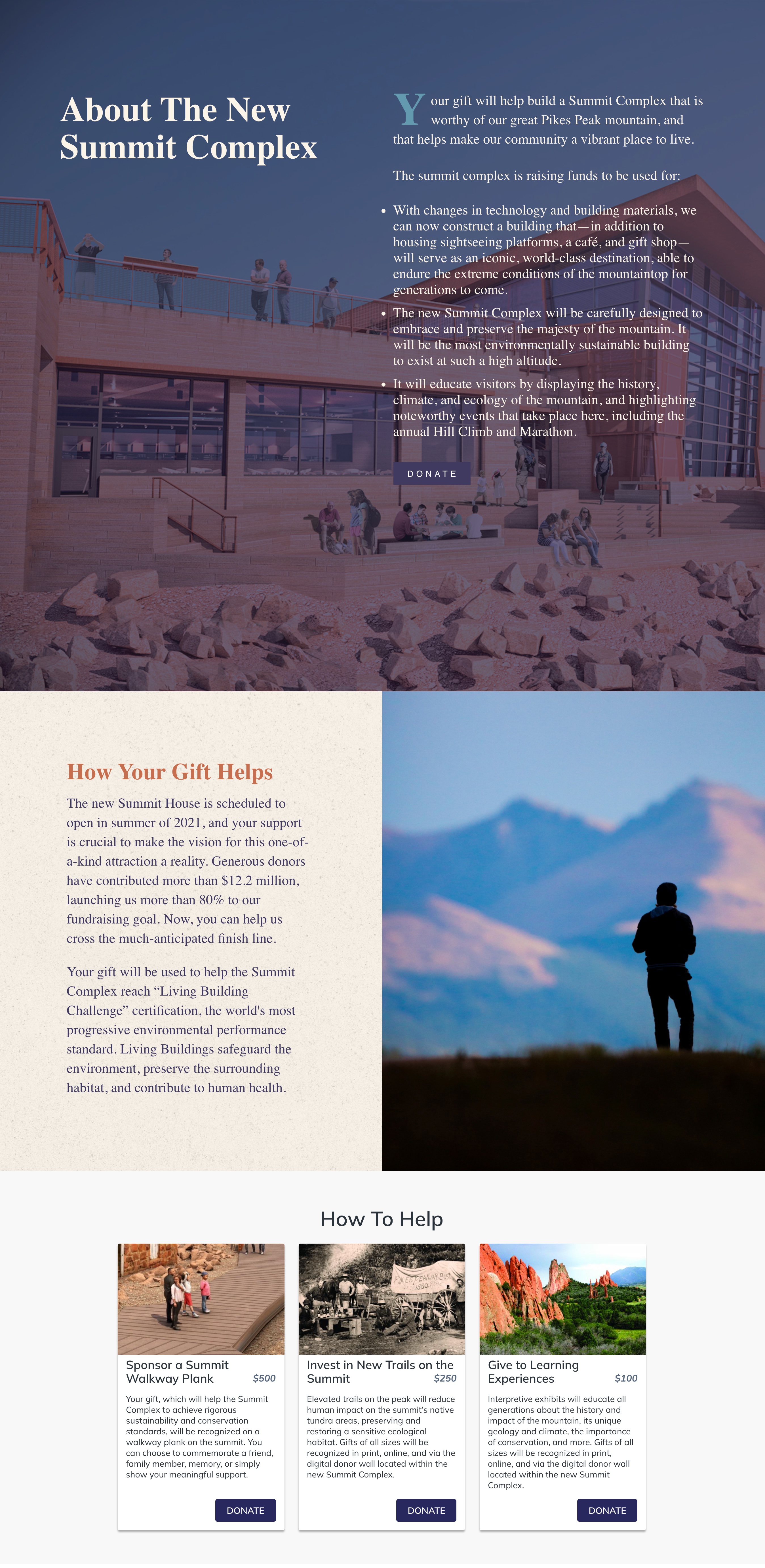
Takeaway for Your Giving Tuesday Campaign: Make sure that any visitor who lands on your Giving Tuesday campaign learns exactly what their gift will go toward.
10. The Salvation Army
It’s clear from the top that The Salvation Army used their successful Giving Tuesday campaign to launch into the holiday season. Bold text speaks to the holidays and the power of donors to help preserve the meaning for people around the world.
We loved how they used illustrations for their impact blocks to create a clean look and feel. Donation amounts are listed from highest to lowest, visually encouraging donors to consider larger gift amounts.
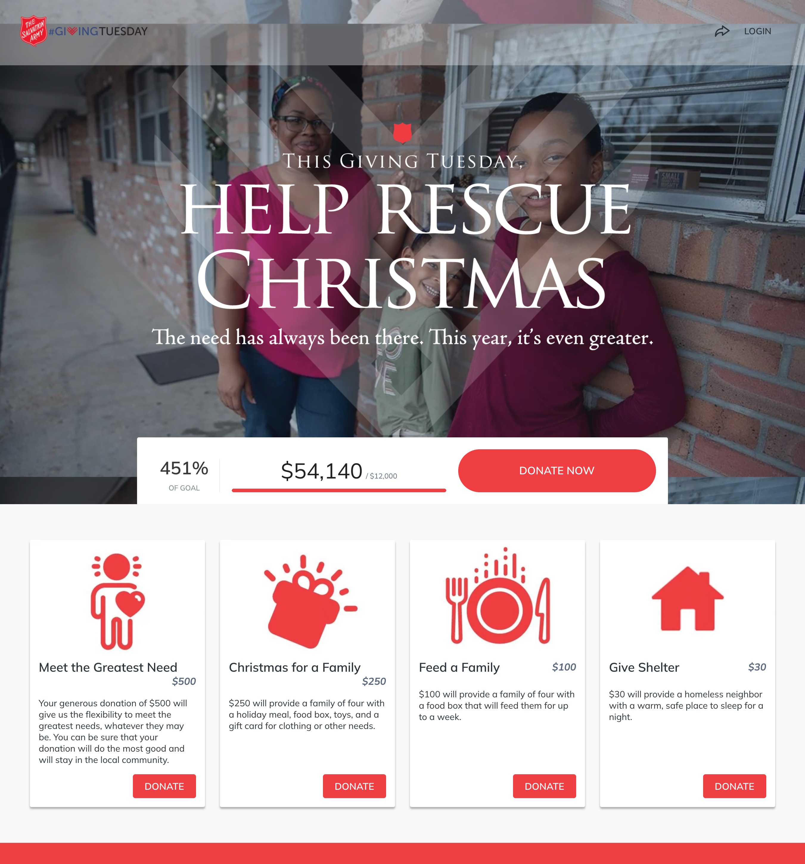
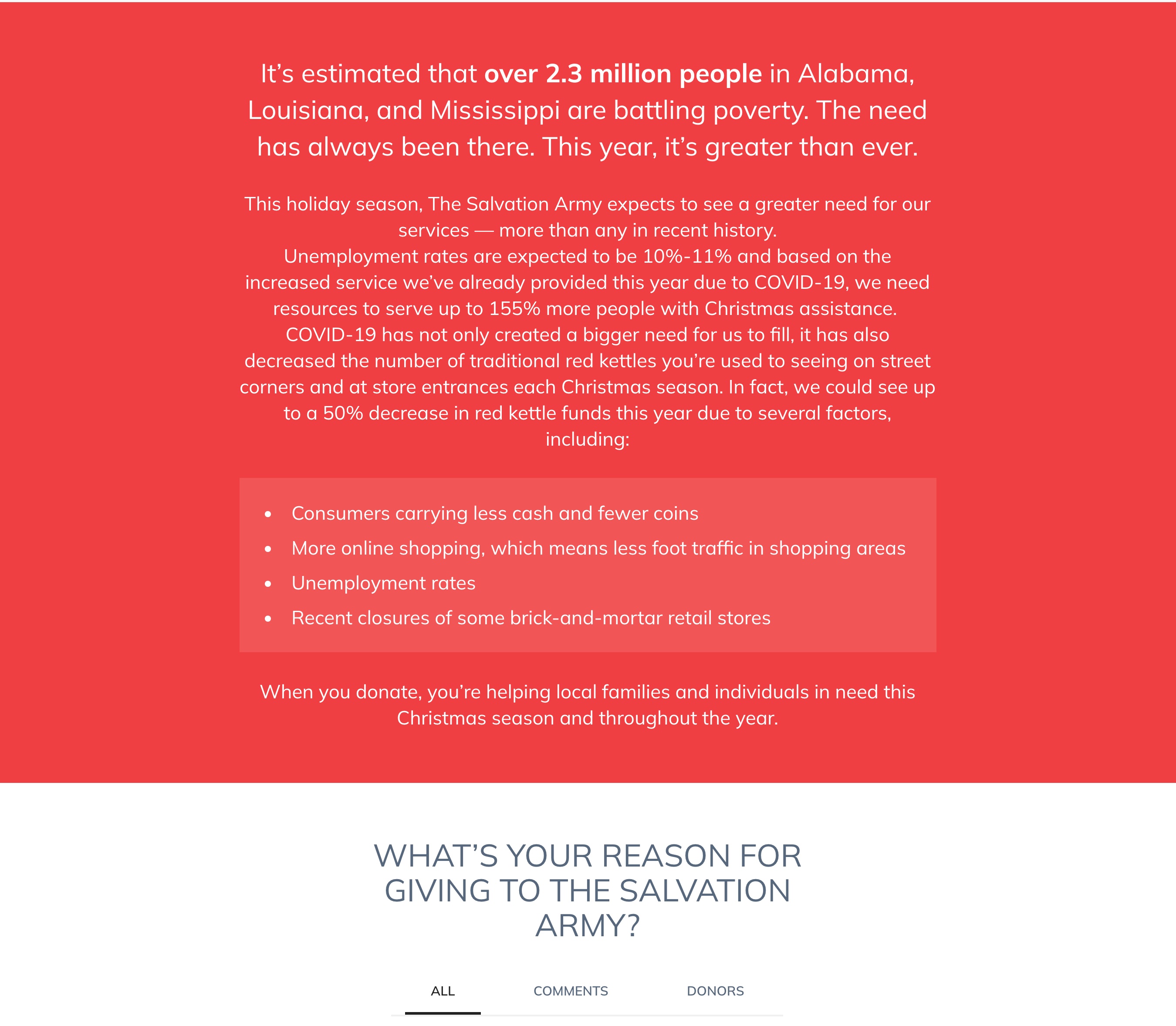
Their campaign further outlines why and how the needs were greater due to the challenges presented by the pandemic.
Takeaway for Your Giving Tuesday Campaign: List your suggested donation amounts from highest to lowest to hopefully encourage larger gifts.
Create a Successful Giving Tuesday Campaign
Strong visual elements, consistent branding, meaningful content, and an intuitive flow all contribute to successful Giving Tuesday campaigns. Get inspired by these examples and consider how you can enhance these factors in your Giving Tuesday campaign this year. Then download our step-by-step 3-Month Giving Tuesday Checklist to plan a successful campaign that catapults you into a successful year-end fundraising season.
Your Free 3-Month Giving Tuesday Checklist
Subscribe to the Classy Blog
Get the latest fundraising tips, trends, and ideas in your inbox.
Thank you for subscribing
You signed up for emails from Classy


Request a Demo
Learn how top nonprofits use Classy to power their fundraising.